PROGRESS
Project Summary
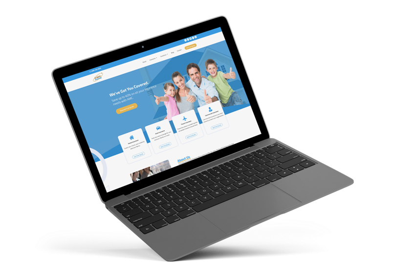
AMC Insurance came to us for a full website revamp since their old website was cluttered with information on every page.
In order to increase the call and email conversions, a large focus was put on the layout restructuring. Doing so, we’ve majorly improved the user experience and created clear content flow on each page.
Website Revamp
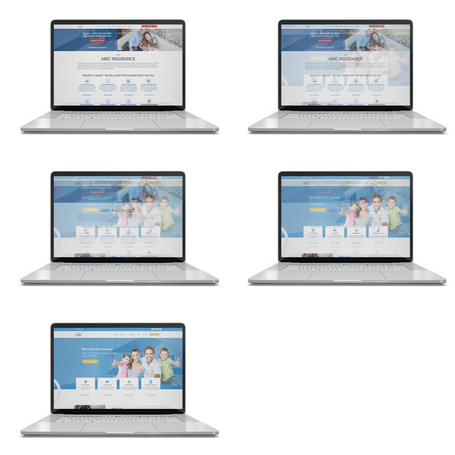
Before & After
With many pages and lots of text, users didn’t bother to read much and simply left the site. This caused a large bounce rate which negatively impacted the search engines rankings.
We carefully stigmatized the website design layout so that an intuitive flow was implemented and users had a clear path to navigate through.
MOBILE WEBSITE VIEW
Web Design For All Screens
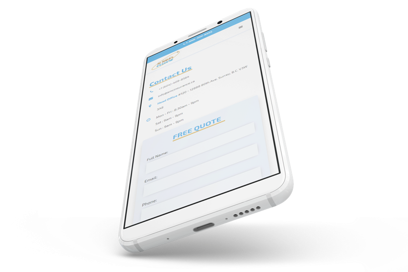
Once the website was fully mapped out and the initial web design desktop structure was laid out, we began planning the mobile adjustments that would take place.
Keeping in mind the responsiveness of the website from device to device, we made the sure web design is flexible to fit users’ screens.
Mega Menu Design
Custom Website Features
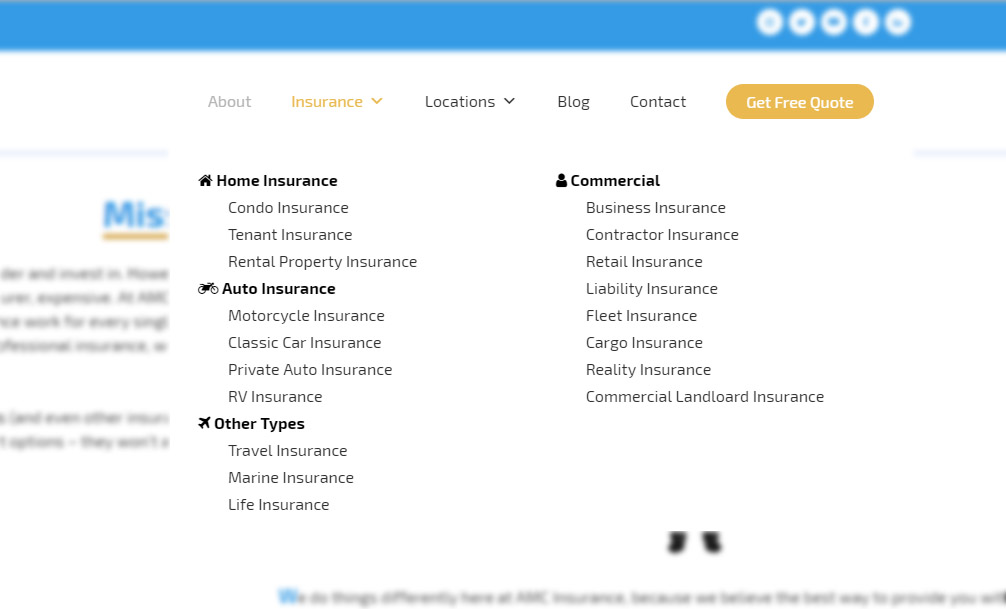
Since the website had a lot of pages, a mega menu was developed in order to organize the focus pages in one area.
The quick hover allowed for less clicks which turned into a much simpler page to page navigation. This allowed users to easily located information at a much faster phase.
FONTS USED
TYPOGRAPHY
ALL EXO 2
The rounded corners yet squared look fit well with the company’s new website modern look. This font type was specifically selected as it’s modern and corporate, yet family friendly.
Palette
COLORS
PRIMARY
SECONDARY
RESULTS
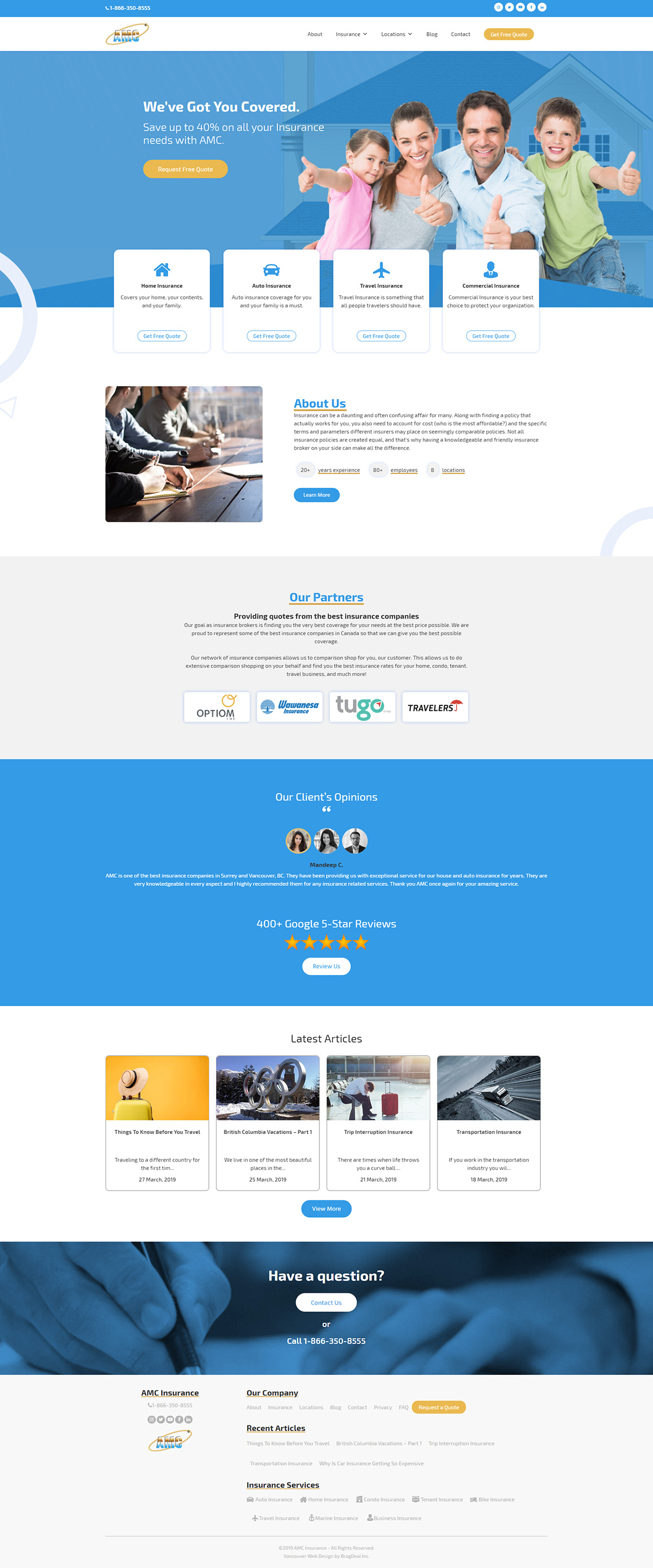
Achievements
AMC Insurance went from an outdated cluttered website to a modern and easy to use web design. The clear navigation through the pages allows users to find what they are after with a much more pleasing experience.

