
PROGRESS
Project Summary
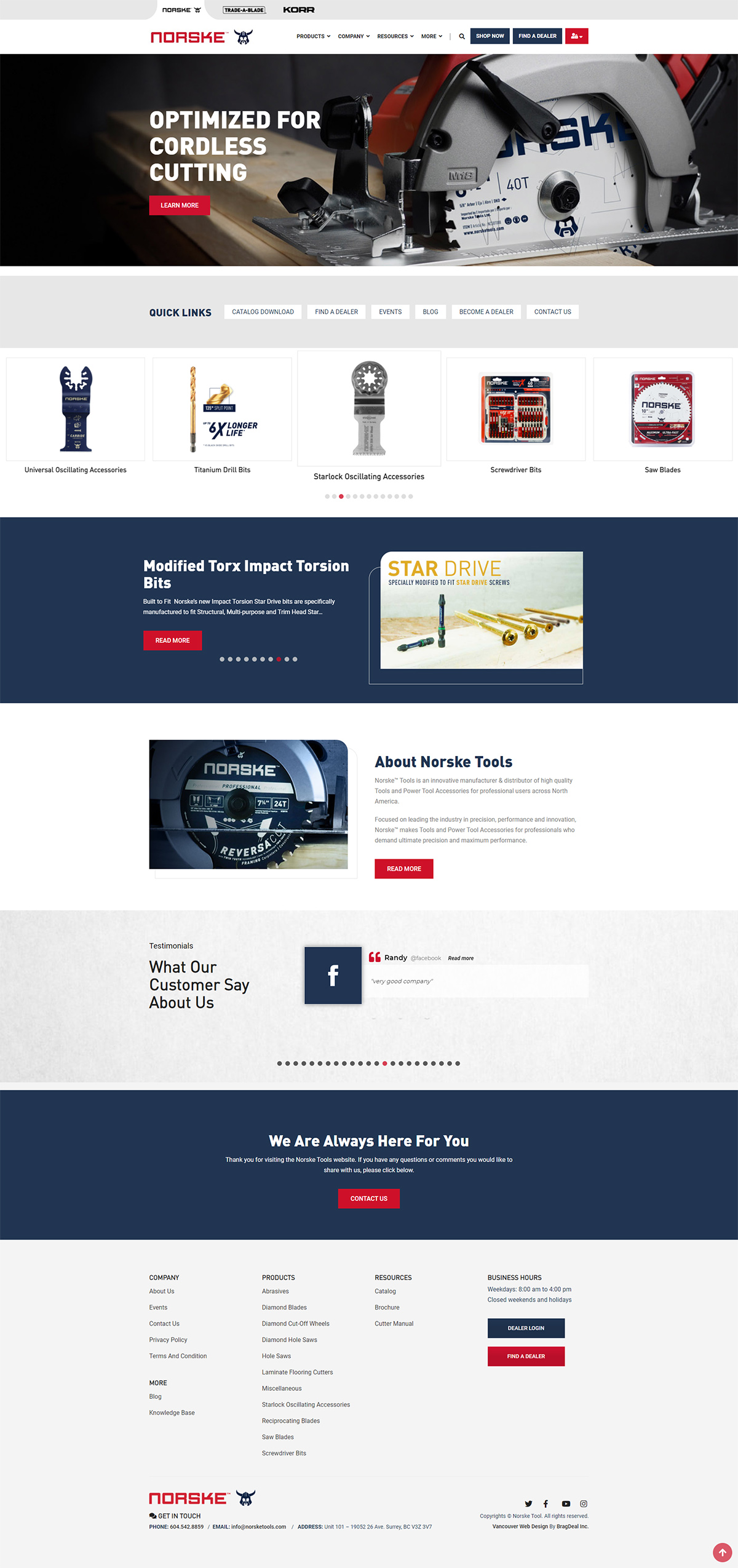
As a growing power tool manufacturer and distributor brand, Norske Tools wanted a full website design revamp as their previous site was outdated and cluttered with information. The goal was to re-organize the pages, combine 3 brands into one website in a simple tab switching format, and overall give the website a modern feel.
WEBSITE PAGE BREAKDOWN
Strategy & Planning
The old site had many categories, products, and information that had to be organized in a clean structure. The main objective was to create an intuitive and user friendly website layout.
The challenge was placing three brands on one website so that the user can easily switch from one to the other without having to leave the site.

Complete Website Revamp
Before & After
While the old site was outdated, it had all the information needed for its potential new customers. The only issue was, it was hard to locate that information as it was hidden within specific areas in specific pages.
We created a fresh new look with a simple structure that works dynamically with the backend. Every update from the administrators would simply reflect on the frontend in the correct spot.

Responsive Layout
Mobile Friendly Design
Since this website is quite large, fitting every detail on the mobile view was quite the task. Page by page we analyzed all the areas that have to fit perfectly on the screen so that users have the best experience. We made sure that every section was set up in an intuitive way to reduce any uncertainties users might have.

Multiple Brands
Seamless 3 Tab Transition
The goal was to create 3 tabs that would represent their own brands under the main umbrella brand Norske Tools. Instead of creating a website for each brand, which would have required different administrator logins, databases, etc. for each site, we created one main backend area and three different frontends.
This was a major challenge as we had to dynamically make the frontend work smoothly and pull information from the backend into the correct spots.

Backend Features
Custom Functionality
Since the customers base is from the USA and Canada, we had to implement IP detection to show the relevant currency for the user coming on. Since the focus is on working with existing distributors as well as acquiring new ones, a custom frontend member area had to be created for those users to submit orders.
From the backend, custom functionality had to be created for different representatives to handle the orders based on country and brand.

FONTS USED
TYPOGRAPHY
Titles DIN Black
This font is bold and clear, making it fit perfectly with the website layout. It easily stands out with the surrounding images and text which helps separate different sections on the page.
p Roboto
In order to have a uniform look across the entire site, Roboto font was chosen for the task. Its clean and professional typography style allows for a very easy flow while reading.
Palette
COLORS: BRAND 1 - Norske
PRIMARY
SECONDARY
Palette
COLORS: BRAND 2 - Trade A Blade
PRIMARY
SECONDARY
Palette
COLORS: BRAND 3 - KORR
PRIMARY
SECONDARY

RESULTS
Achievements
This was a major website revamp with many new functionalities and features that didn’t exist on the previous site. We successfully combined 3 brands into one website, created a simple dashboard for reps to log in and do their daily tasks, and much more!