PROGRESS
Project Summary
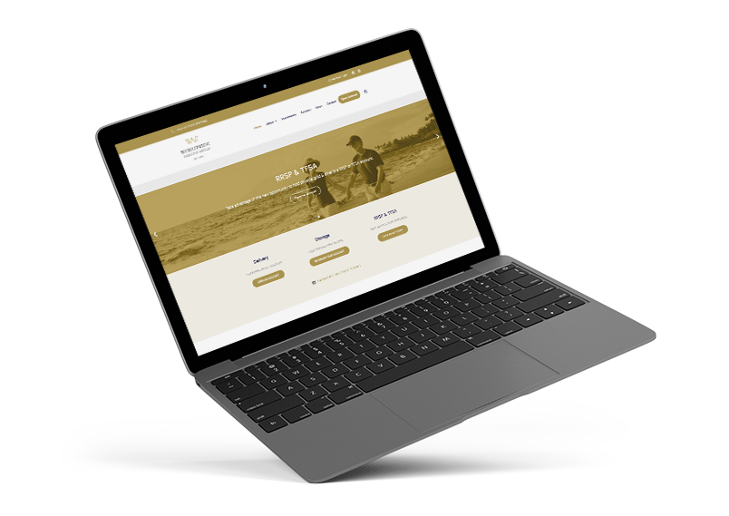
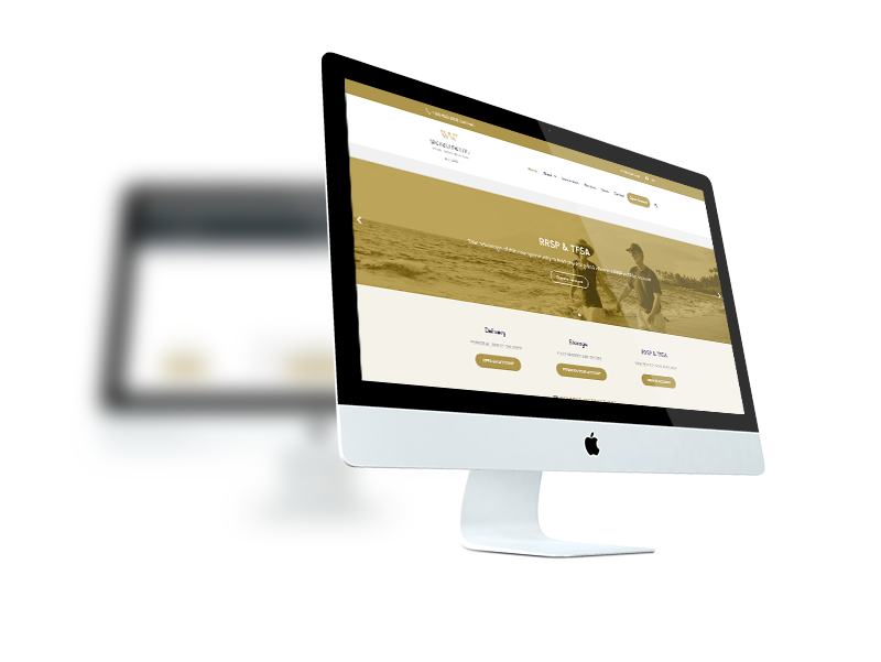
While revamping WWPMC, our goal was to create a user-friendly, sleek design. We aimed to improve how visitors navigate the site while making it engaging and in line with the company’s values. We kept things simple, using dynamic elements to capture attention. The result is a responsive website that not only reflects the client’s vision but also helps them stand out with a high end precious metals web design.
FULL WEBSITE REVAMP
Before & After
Before the transformation, the old website had begun to show its age. From an outdated design that made it difficult to navigate around the pages to effectively help increase conversion. The site lacked responsiveness and interactivity, leaving visitors with a static and dull experience. Fast forward to the new website, and the difference is very clear. The revamped design has a modern and user-focused approach. It’s not only visually appealing but also intuitively organized, ensuring seamless navigation and an engaging interaction for every visitor.

MOBILE FRIENDLY
Adjusts To All Screens
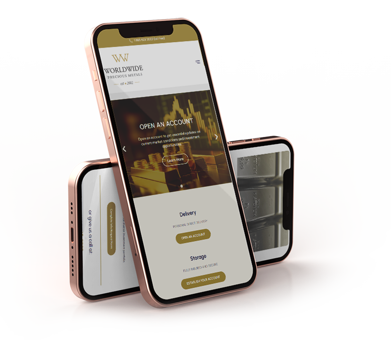
We put extra emphasis to the mobile version, prioritizing mobile responsive web design. Recognizing the growing trend of users accessing websites via smartphones and tablets, we aimed to ensure a seamless experience across all devices. The old website had struggled on mobile platforms, with a clunky, non-responsive interface. However, the new design caters specifically to the mobile audience. It adapts effortlessly to various screen sizes, guaranteeing that users on the go can access information, explore services, and engage with the website just as easily as those on desktops.

FONTS USED
TYPOGRAPHY
Title Urbanist
Utilizing the Urbanist font for titles was chosen due to its contemporary and highly legible design. This allows to convey professionalism and modernity. This font strikes the perfect balance between aesthetics and readability, enhancing the overall visual impact of the website.
p DM Sans
This font is used for general text throughout the website, and it proved to be a great selection. This font’s clarity and readability significantly enhanced the overall user experience. Its clean design made content easily accessible, ensuring that visitors could consume information effortlessly and engage with the website with minimal effort.
Palette
COLORS
PRIMARY
SECONDARY

RESULTS
ACHIEVEMENTS
This website revamp project achieved outstanding results, marking a significant transformation from its previous version. The modern redesign, paired with a user-focused approach, led to improved navigation and a more engaging user experience. The integration of mobile-responsive web design expanded the site’s accessibility, catering to a wider audience.

